The Pantone Institute is recognised as the world authority on colour trends and colour matching. Twice a year, the Institute releases a colour palette for the upcoming Northern Hemisphere spring and autumn (fall) seasons. This palette serves as a guide and inspiration for the cosmetic, fashion and design industries.
MORE: Fresh Off The Runway: Minty Green
Pantone released their Fall 2015 colours back in February, in time for Northern hemisphere designers and jewellers to plan their trends in time for their autumn season. While it might seem strange to talk about autumn colours as we approach summer in Australia with plenty of sunny days ahead, fashion-forward Aussies can use the Pantone guide to stay one step ahead of their fellow fashionistas for 2016.
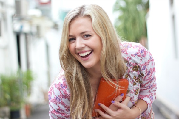
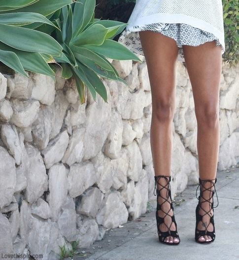
As you would expect for an autumn release, Pantone’s Fall 2015 colours have an earthy, neutral feel with some bright colours to balance out the palette. Recent designer collections have had a strong 1970s feel. Suede is making a comeback and jeans are getting wider as flares are once again socially acceptable. In a nod to this outrageous era, Pantone selected Cadmium Orange for fall 2015; a bright, fun hue that adds contrast without harshness. Orange and blue can be stunning together, and the cool teal of Biscay Bay with the deeper blue Reflecting Pond offset the warmer tones of the colour collection. Amethyst Orchid’s bright purple provides contrast without being overpowering, and the soft pink of Cashmere Rose rounds out the bold colours of the palette. Marsala continues to contribute a rich, warm red as 2015’s Colour of the Year. This shade is the perfect combination of robust colour with an earthy undertone.
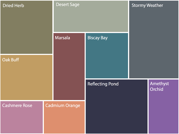
The neutral colours chosen for fall 2015 are reminiscent of a cool autumn day. The greenish-grey of Desert Sage with the darker grey of Stormy Weather and Dried Herb (an olive shade) provide cooling tones as the Northern hemisphere approaches the winter months. The final neutral colour is Oak Buff, a warm yellow-gold tone to balance the other, darker neutrals.
MORE: Colour Pop At Diane Von Furstenberg
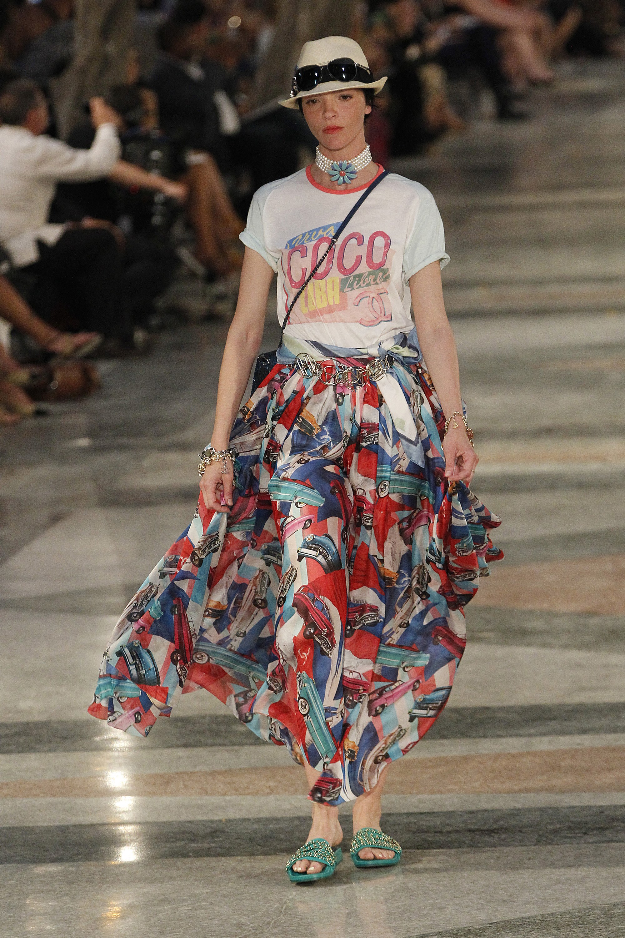
So what does this new colour release mean for Australian fashion? Those of us thinking ahead to autumn 2016 will be keeping an eye out for olive, blue-grey and yellow neutrals mixed with statement colours of orange and blue. If you love to wear pink or purple, incorporate the bright jewel tones of Amethyst with warmer, more understated pinks to help you stay on-trend after the long, hot Aussie summer draws to a close.
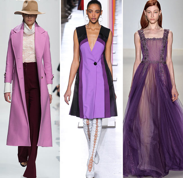
Image sources: Amethyst runway image via Fashionisers, colour chart image via Second City Style, feature image via Pantone